Work done in collaboration with Juwon Lee, Erin Wang, Brandon Yap, Ally McCabe, and Norman Zeng.
OVERVIEW
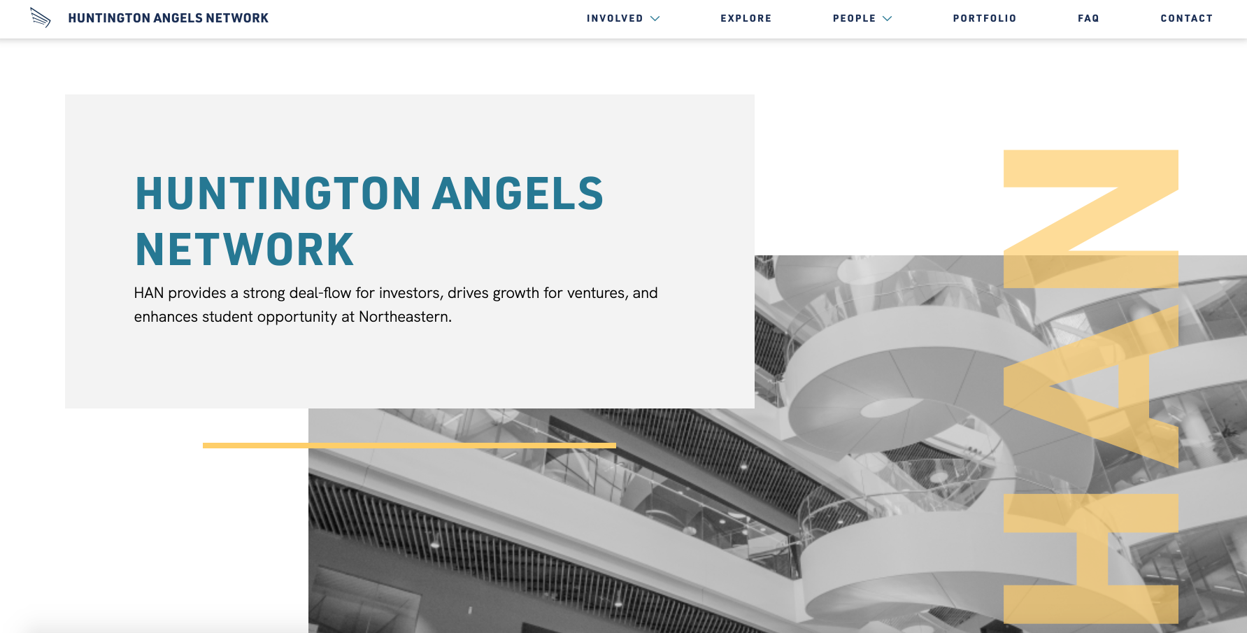
In Fall 2020, I worked as a Studio Developer for Scout, Northeastern's student-led design studio. Over the course of five months, our team of five designers and developers did a rebrand and created a marketing website for our client, Huntington Angels Network - a student-led venture capital organization.
THE CHALLENGE
Huntington Angels Network is a student-led venture capital organization that connects Northeastern alumni startups with angel investors. HAN has had an impressive track record, having worked with 100+ investors connecting over $3.5 million in capital to date. However, they were struggling with their brand and marketing presence when they approached Scout, and they needed a unified brand identity and website that could communicate their professionalism and credibility to prospective investors, ventures, and students.
THE SOLUTION
MARKETING WEBSITE
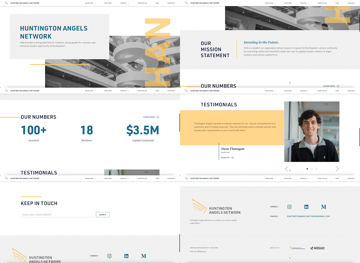
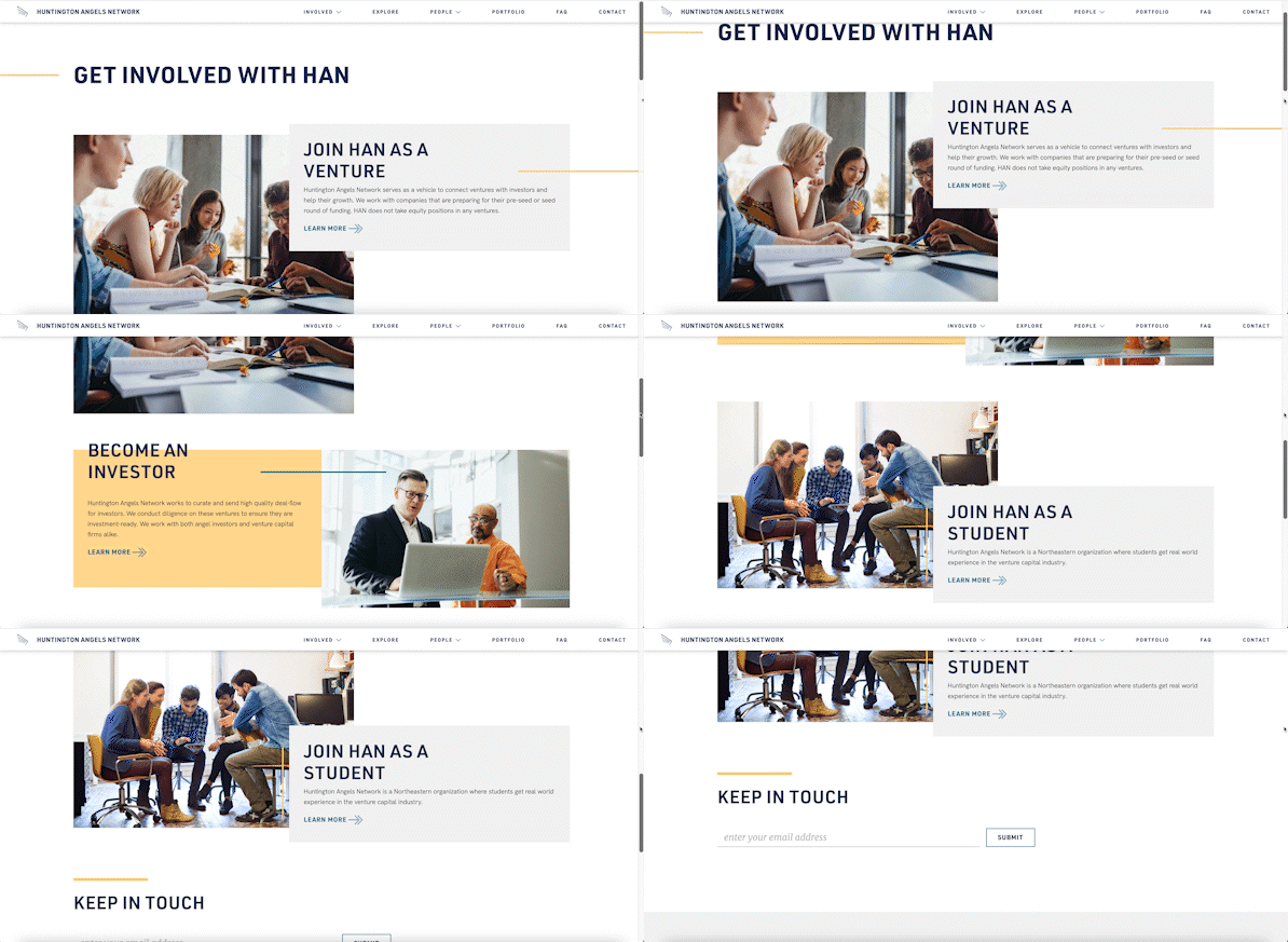
As a student-run organization with a modest budget and website information that would need to be frequently updated from semester to semester, HAN wanted a website that would be easy to maintain without developers, while staying within budget. Taking these needs into consideration, we decided to use React, Gatsby, Contentful CMS, and Formspree for the site, and deployed it on Netlify. Contentful CMS is a powerful content management system which allows the Huntington Angels Network team to edit website information such as event times, member photos, and application forms, without needing to change the code of the website. We used GraphQL to retrieve data from Contentful, which we then styled according to the high-fidelity wireframes using Styled Components. We chose to use Gatsby as a static site generator for its built-in optimizations on the site's load time, and its smooth integration with Contentful.
Working with one other developer, I was responsible for architecting, coding, and deploying the site, as well as writing documentation and training our clients on Contentful CMS so they could continue to update the site after our collaboration ended. During the development process, we abstracted many of the website's components into reusable, styled code blocks. This helped us maintain visual consistency on elements that were used throughout the website, while helping us to cut down on duplicate code.
BRAND AND UX DESIGN
Although my main role was a developer on this project, I helped with the brand identity design and wireframing. Below are some brand exercises and wireframes (both low and high fidelity) that I worked on:
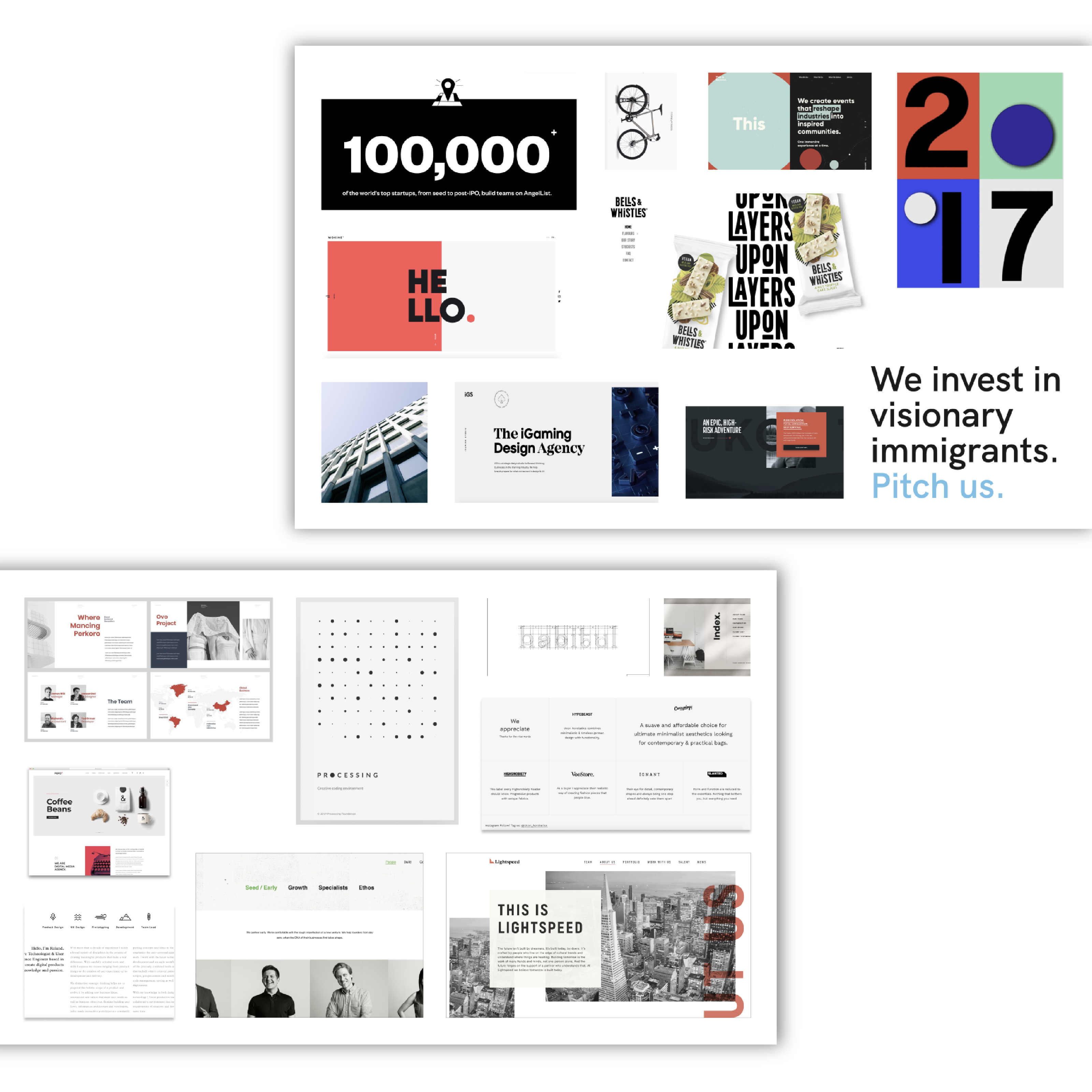
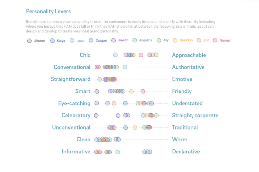
Left: two of the final moodboards we created as brand research. Right: brand exercises done with the team and client.
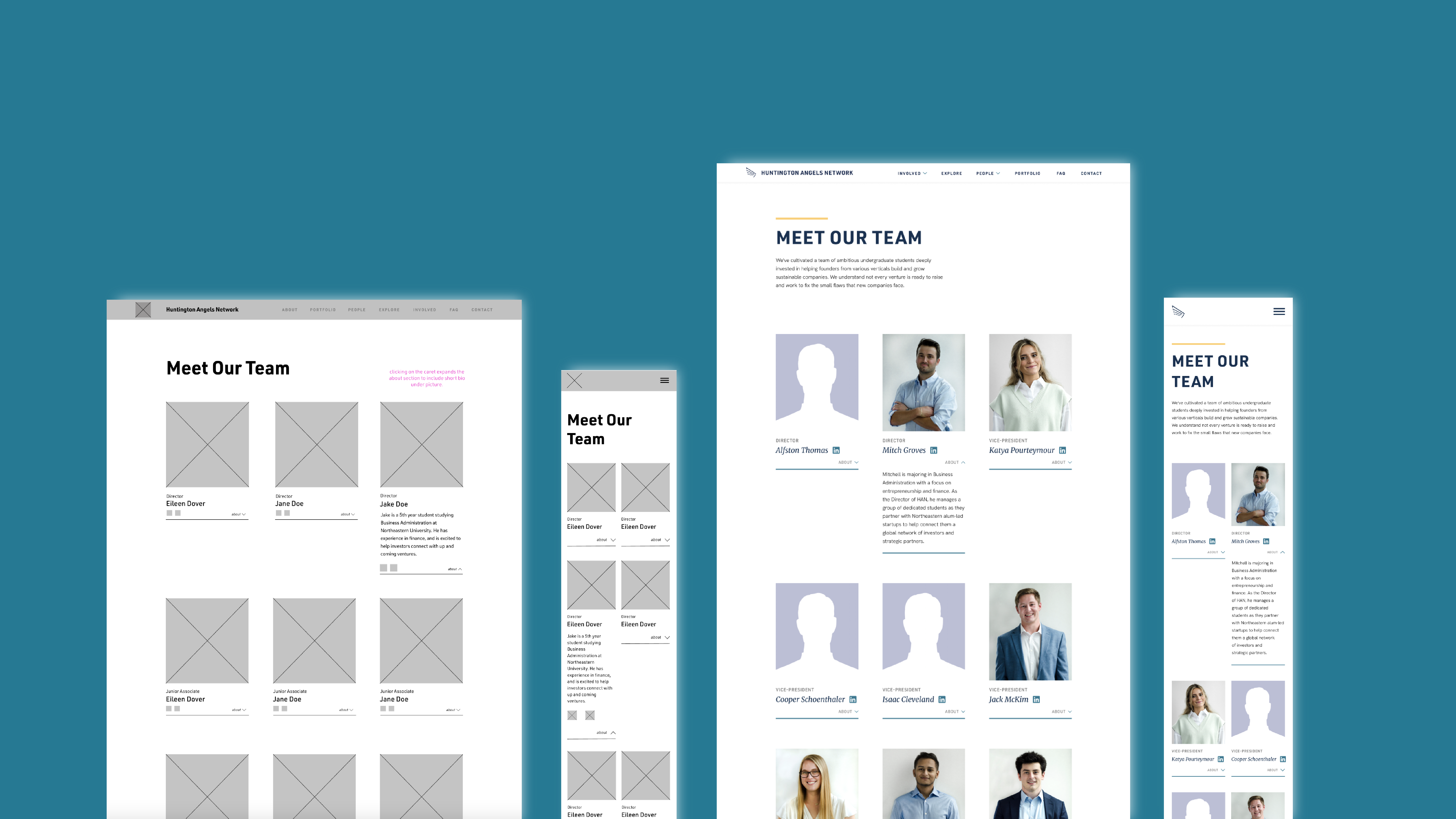
Low-fidelity and high-fidelity wireframes of the Team page
TAKEAWAYS
This project introduced me to several new technologies, including Gatsby, GraphQL, and CMSes. Working with the client who did not have a technical background, I realized how important it was for future maintenance of the site to be easy and achievable without touching the code. Additionally, collaborating with other designers and developers on my team taught me the importance of communication and explaining my design/dev choices, as well as establishing coding best practices from the beginning to keep our codebase organized.
One major challenge we ran into during this project was with scoping. Towards the end of the semester, we realized that the sheer amount of development work left was too great for two developers to complete, and we had to make adjustments to some website features in order to complete a Minimum Viable Product. This was a valuable lesson to learn for project planning in the future; after this experience, I've begun to place more importance on estimating work and communicating potential changes to our deliverables earlier in the process.
Overall, I learned so much from working with my team and our client over the course of several months. I'm proud of the work we've done and hope Huntington Angels Network will enjoy their new brand and website for many years to come.
